

If you're using email newsletters as part of your practice's marketing strategy, it is important to create mobile friendly e-blasts so your message is delivered and properly displayed to all your recipients. To make your newsletter mobile friendly, here are a few tips to help guide you during design.
Related Article: 5 Examples of Great Dental Newsletter Practices
- A Clean, Responsive or Single Column Design
- Less is More for Images
- A Clear Call to Action
- Link Articles and Content to Your Website
- Important Information in the Top Fold
- Highly Contrasting Colours
When optimizing for mobile, it is important to realize that the limitations of screen space is the primary driver. Crowd it at your peril. Mobile users are willing to scroll down the screen, but not pinch and zoom in to read through the text.
A responsive template uses CSS to help control the layout of the e-blast on various screen sizes, most usually displaying multiple columns on a desktop, and single column on smaller screens.
A Single Column layout is an even simpler responsive layout that stretches the width of a single column up to a usual maximum size of about 600 pixels (which will increase as screen resolution gets better and better over time.
Either solution, will allow you to create a design that is mobile friendly, concise, and to the point, providing an optimal experience for your readers. A single column template becomes the lowest-common-denominator approach, while a responsive design allows you to take more advantage of desktop sized screens. Why not always go responsive? Because there are a surprising number of mail apps that don't yet fully support the CSS media queries’ which enable this functionality. So you might end up doing extra layout work that can't be taken advantage of on some email apps.
Remember, the greater the viewing experience, the higher amount of engagement, and the less chance of unsubscribers.
Here's an example of a newsletter for Toronto Children's Dentist, based on a 600 pixel wide responsive design. Much of the content is split into two columns on the desktop and shows as one column on smaller screens with the images shown above each text section.

Less is more when it comes to using images on a mobile friendly newsletter. The more images, the 'heavier' your email becomes, which results in a longer loading time. That's why it's best practice to use up to three or four images. Luckily that also works well with more modern minimalist brand styles.
Since opening emails on mobile devices often also uses mobile data, downloading images on a mobile could require a significant amount of data to be used, which some customers wouldn't want. Also remember that on various devices and apps, users have the option to turn off image download in emails when their phone is using mobile data. Therefore it's even more important to include 'alt' tag text on your images so readers can see what that image was about instead of a blank white space.
For bonus points, images can be optimized for multiple screens sizes (more css) so the file size is reduced to maximize download speed and screen resolution.
Your e-blasts need to have a purpose. Now that your patients have opened your email, what is it that you would like them to do? Whether it’s to visit your website, request an appointment, inquire about a service, your answer to this question should be your main call to action. Your CTA should be placed strategically, and best practice is to have it at the top. Make sure it's visible and stands out so it catches your viewers’ attention. (Use a minimum width and minimum height of 44 pixels so it's easily tappable for touch screens). In the example below, Cohen Endodontic Associates have a 'Patient Referral' button within their header area when sending to referring dentists.

Related Article: How to Craft an Effective CTA
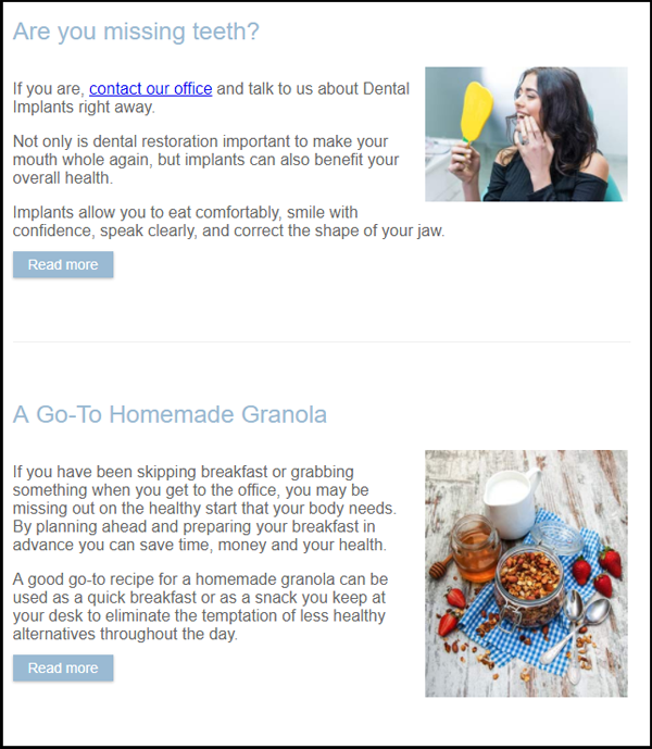
Your newsletters should be a platform to highlight important things instead of covering content like a magazine. Consider using it as a digest instead of having a lot of content in the form of long articles. Best practice is often to use a little interesting and eye catching excerpt or teaser from the article and add a 'read more' or similar link. The example below for Upper Avenue Dentistry demonstrates this technique. This often improves the reading experience for your audience, especially if your website is responsive for all screen sizes.
Related Article: What Makes a Good Dental Website?
"Top of the fold" refers to print newspaper parlance. It asks what information is important enough to be above the fold and most visible for passers-by. Sometimes, your email viewers open the email but don't scroll all the way down. So it's important that all the important information like logo (since it displays your branding), contact information, and main call to action should be in the top fold or first visible portion of your email so you can quickly grab your viewers' attention.
When it comes to mobile friendly newsletters, highly contrasting colour palette has been recommended. Not only is it a good idea to meet visual accessibility standards, but readers could have the mobile brightness dimmed or use their phones in bright sunlight. So it further supports the best practice of using dark text on a light background so content is more visible.
Here's an example of, Bloor Dental Health Centre's newsletter background colour palette with either white or a very light blue as the background colour with black and purple text.

Other things to keep in mind when designing your newsletter:
- Include the unsubscribe button at the bottom, far away from other buttons so visitors don't click it by mistake, especially when scrolling on their phones.
- Have a short and catchy subject line that tempts the viewers to open your email. Here are 5 tips to help you write a great subject line.
- Test.Test.Test. Before sending out your newsletter, make sure you check it on multiple platforms and browsers, adjust for visual bugs.
- Get someone else to review the copy
- And check for bad links.